
Hello and have a nice new year everyone 🍀✌️
Last week I was reading through the results of research that looked at the key elements of packaging design in the retail environment in terms of primary shelf display. One of the key factors influencing grabbing the initial attention of customers was the simplicity of the design itself. And the existence of contrast and shapes was defined as an absolutely essential feature of the packaging.
We focused on the importance of contrast in relation to attention in the last episode, in today’s episode we will focus on simplicity, which can bring not only beauty to our marketing materials, but more importantly, initial customer attention leading to interest and ideally purchase of the product.
Our brains love simplicity!
Why does our brain love simplicity? Because it costs it less energy used to process the information it receives. For millennia, our bodies have been conditioned to function at maximum efficiency and save energy for harder times. To process information quickly and efficiently, our brain is in system 1 (auto-pilot), which likes to work with colors and shapes. If we offer colors and shapes to system 1 while keeping it simple, our brain will work quickly and efficiently without having to engage system 2 (the pilot), which is slow and costs us much more energy. System 2 kicks in at the very moment we abandon simplicity and start adding more visual attributes.
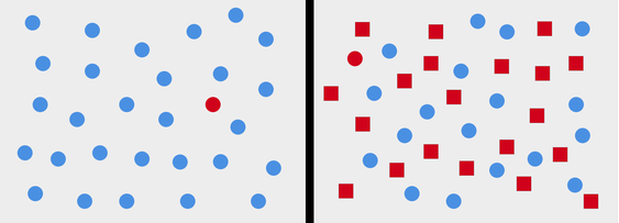
The task for you. Find the red dot.
This fact is nicely illustrated by the task above – find the red dot on the left and right picture. Solving the task in the image on the left is “self-explanatory” (solved by autopilot, system 1), but adding new visual attributes to the image on the right has made the task more complicated and takes longer to solve (pilot involved, system 2).
What does this mean for us in practice?
In practice, it means for us that the more images, text or other graphic elements we use in the design, the more we make the target audience’s “job” more difficult and the more we risk that our communication will be overlooked by the customer because they don’t want to waste time and energy studying our messages.
The most common solution to simplify the design is to prioritise the message, i.e. to identify one single key message based on the main objective of the communication.
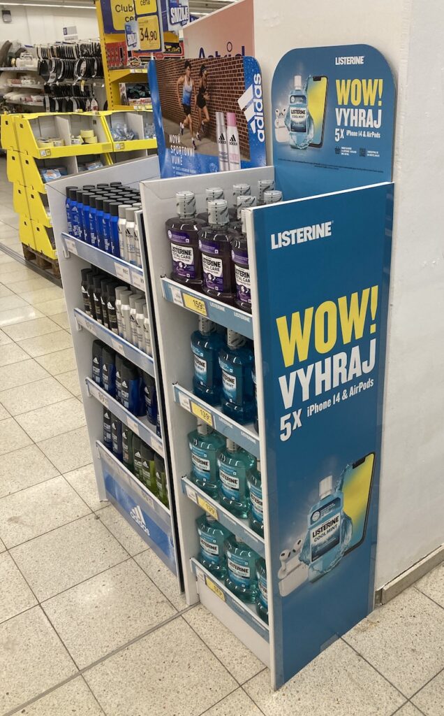
An example from the market: the minimalist Listerine graduation stand with gift mechanics.
A big challenge to simple visuals are the promotional mechanics, which we sometimes complicate ourselves by adding more levels of prizes and thus complex rules. A nice example of a simple and strongly communicated gift graduation is the Listerine stand pictured above. It gets the customer’s attention through a catchy and simple CTA supported by a display of exciting prizes near the product itself. Yet even here there would be room for simplification, can you find it?
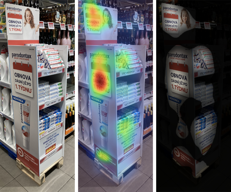
An example from the market: the Parodontax novelty stand and attention analysis using a predictive eye camera.
If we work with facts in our work and we want to verify the primary attention of customers on data, it is suggested to use the outputs of a classical or predictive eye camera. Using the Parodontax rack example above, we can see that customers’ primary attention goes to the uniform CTA and branding of the sidebar as well as the topper, in addition to the products. On the topper, a picture of a woman is still vying for attention, navigating the shoppers’ eyes very nicely with her gaze and hand towards the products on display below.
There is beauty and attention in simplicity, let’s take it to the ❤️.
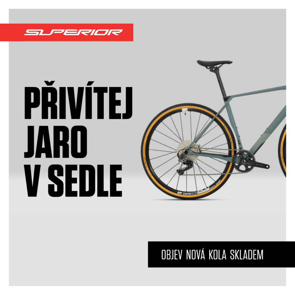
Example from online: minimalistic design and clear message through headline and CTA.
From attention to conveying the key message
In the next episode of Learning Designcheck.ai, we’ll move from getting attention to delivering the key message. We’ll look at the opportunities we most often find when evaluating marketing communications. The goal is to be able to communicate the essentials to customers, taking into account the environment in which our communications are situated.
I wish you both an attentive and attention-worth new year,
Jan from Designcheck.ai